

Avoid The AI Vanity Metric Trap
Why the easy numbers lie and what to track instead.


This week’s newsletter is sponsored by Bright Data.
Turn the Web Into A Data Pipeline. Generate Your API, in Minutes.
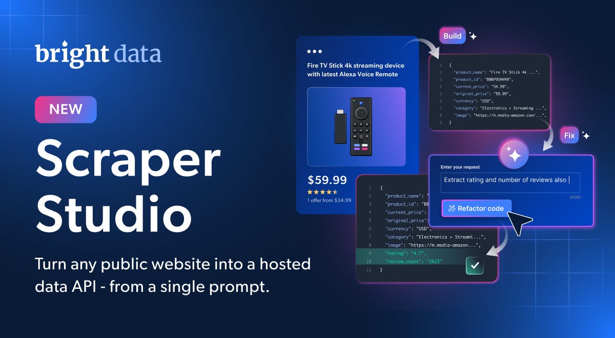
If your team is still patching selectors and rotating proxies, you’re maintaining infrastructure your competitors stopped owning.
Scraper Studio - launching today from Bright Data turns any public website into a hosted data API from a single prompt:
Self-healing scrapers that detect site changes and patch themselves
Proxies, unblocking, and parsing handled - not your problem
Build from Claude Code, Cursor, or Codex via CLI - or visually in the control panel
Scale production data pipelines without owning the stack
5,000 free credits every month
No sales call. No demo. Just spin up a scraper and watch it run.
Thanks to BrightData for sponsoring TIE, now back to AI metrics.
Same difference
Every few years, it seems our industry rediscovers the same lesson under a new label.
We did it with velocity
We did it with story points
We did it with lines of code
Now we’re doing it again with AI.
We measure what’s easy instead of what matters. Then we wonder why the numbers look great but nothing feels better.
Easy to count, hard to trust
Imagine you’re writing a book. You use Claude to generate 100 pages of content. You prompt, it writes, you prompt again, it writes more. Before long you have something that looks substantial.
But it’s nonsense if you don’t pay attention to what it’s actually writing.
The same is true for code. I could generate millions of lines of code per day with Cursor, Claude Code, and other coding agents if I wanted to. But more lines of code just become a liability. Just like you don’t need ten pages in a book describing an idea that takes one sentence, you don’t need unnecessary lines of code.
Lines of code have always been a broken measure – you can type one word per line and inflate your numbers, or write inefficient code that takes twice as many lines as it should. We already knew this metric was broken before AI. Now, with AI generating code at scale, the problem is just more obvious.
Yet teams keep defaulting to numbers like “tokens spent per month.”
Why? Because those numbers are easy to count. No one argues over them. No interpretation required.
But easy to count and useful to know are different things.
Why teams default to easy numbers
When people ask for AI adoption metrics, they often want a flashy number to report upward. That pressure is real.
But sometimes the problem is simpler: nobody knows what else to look at, so the convenient metric wins by default.
Here’s the issue. These numbers can hide garbage behind sheer volume. PRs get bigger and faster, but now everyone’s firefighting reviews that don’t make sense. Output goes up while quality stays flat – or drops. The dashboard looks great. The team feels worse.
There’s also a subtler trap underneath this. Writing code was never really the bottleneck. The bottleneck was always deciding what to write – understanding the system, architecting the solution, knowing which risk to take. AI compresses the grunt work. It doesn’t replace the thinking. So if you’re measuring keystrokes, you’re measuring the wrong layer entirely.
If you’re measuring AI’s impact by counting generated lines, you’re measuring activity, not progress.
What actually moves
On our team, we track the same thing we tracked before AI: the number of useful things shipped per sprint. That velocity matters. But AI’s real contribution shows up in places traditional dashboards miss.
Cycle time compression
The time from idea to testable code has shortened. Previously, building a prototype was a major undertaking – rough mockups, back-and-forth over weeks. Now, whenever someone has a hypothesis, they can just build it. Things that used to take weeks take days. Even if AI handles 90% of the work, it’s still a major improvement.
One technique worth knowing: if you want a fast win and you’re working in a legacy codebase, don’t force AI into the old process. Spin the feature up as a standalone app or isolated service instead. Let your coding assistant implement it, validate the idea in a day, then present that. It’s much faster than trying to wedge AI into a system it doesn’t know well, and it gives you something concrete to show.
Risk appetite
This one is subtle but significant.
Teams are now willing to tackle work they used to avoid. Major refactoring that would require huge regression testing? We’d put that off for months. Now you can spin up a coding agent, review its plan, course correct, and let it implement. If you have tests, it works well. The activation energy for risky work has dropped.
Backlog decay
Fewer things sit untouched for months. That React Native upgrade connected to every other library – the one that required rebuilding and retesting the whole application? Before, that was a risk you kept postponing. Now you can actually attempt it. And while the agent works, your engineers are working on something else.
Stage-level speed, not overall averages
This is where most teams measure wrong. They average AI’s impact across the whole development process and get a number that feels underwhelming. The real gains are concentrated in specific stages – and those are worth reporting on their own.
For us, the technical analysis stage – where we analyze the system and architect the solution – moves significantly faster with AI. Actual development speed varies across engineers, but planning speed has improved across the board.
Design is another area: our designers now produce early wireframes much faster, working with AI directly. Data engineers use AI to write database queries. Product managers read analytics more efficiently.
We also see a big difference in our QA workflows. It used to be a bottleneck. Now our QA engineer automates a big chunk of it, and it takes only one person to make sure we nip risks in the bud and provide the best user experience.
When you look at the whole process, you see gains scattered across stages that never show up in “lines generated” reports. Don’t average them out. Zoom into the hot spots and report those.
The excitement plateau is not a problem
Early in AI adoption, people are visibly excited. You hear it in meetings. You see it in Slack. Then, a few months in, the energy settles. The same engineers who were buzzing about AI are quieter now – not because it stopped working, but because it became normal.
This is easy to misread as stagnation. It isn’t.
What’s actually happened is that AI became part of how they work. They’re still more productive than before. They’re just not constantly marveling at it. Getting comfortable with new tools is a sign of real adoption, not failed adoption. The fireworks ending is a good thing.
Where it does matter is in your reporting. If you were tracking sentiment as a proxy for progress, the plateau will look like a drop. That’s another reason to measure what changed in the work, not how people feel about the change.
The short version: measure what changed, not what was generated
Vanity metrics like lines of code or “percentage of features built with AI” are easy to count but tell you almost nothing useful. The real signals live in specific places.
Cycle time: from idea to testable code — and whether that gap is closing
Risk appetite: are engineers tackling refactors and upgrades they used to avoid?
Backlog decay: how many long-postponed projects are finally moving?
Stage-level speed: technical analysis, design wireframes, data queries, test coverage — report these individually, not as an average
Flexibility: can engineers move across unfamiliar parts of the codebase faster than before?
Don’t flatten these into a single adoption score. Zoom into where the gains are real and report those with specifics.
And when the excitement plateau hits – and it will – don’t mistake it for failure. It means AI became normal. That’s the goal.
We’re in a period of constant weekly improvement. The teams that stay engaged, keep experimenting, and measure honestly will keep finding the next edge. The ones waiting for a cleaner picture will be waiting a long time.
Enjoyed This?
📩 Subscribe
❤️ Hit the heart
💬 Comment
🔁 Share
🌱 And help this newsletter grow!
Thanks for this post. Velocity can easily become a vanity metric for leaders because it measures activity, not impact. In fast-moving, AI-enabled environments, it can even end up reflecting internal performance signaling more than external value creation.
If we’re using velocity as a productivity metric, then we should first ask: what do we actually mean by productivity? Only then can we decide whether velocity is the right measure. For now, velocity is still measured but not as an isolated metric.
I wrote a post last week about this here: https://theaitrain.substack.com/p/how-i-changed-the-way-my-team-measures